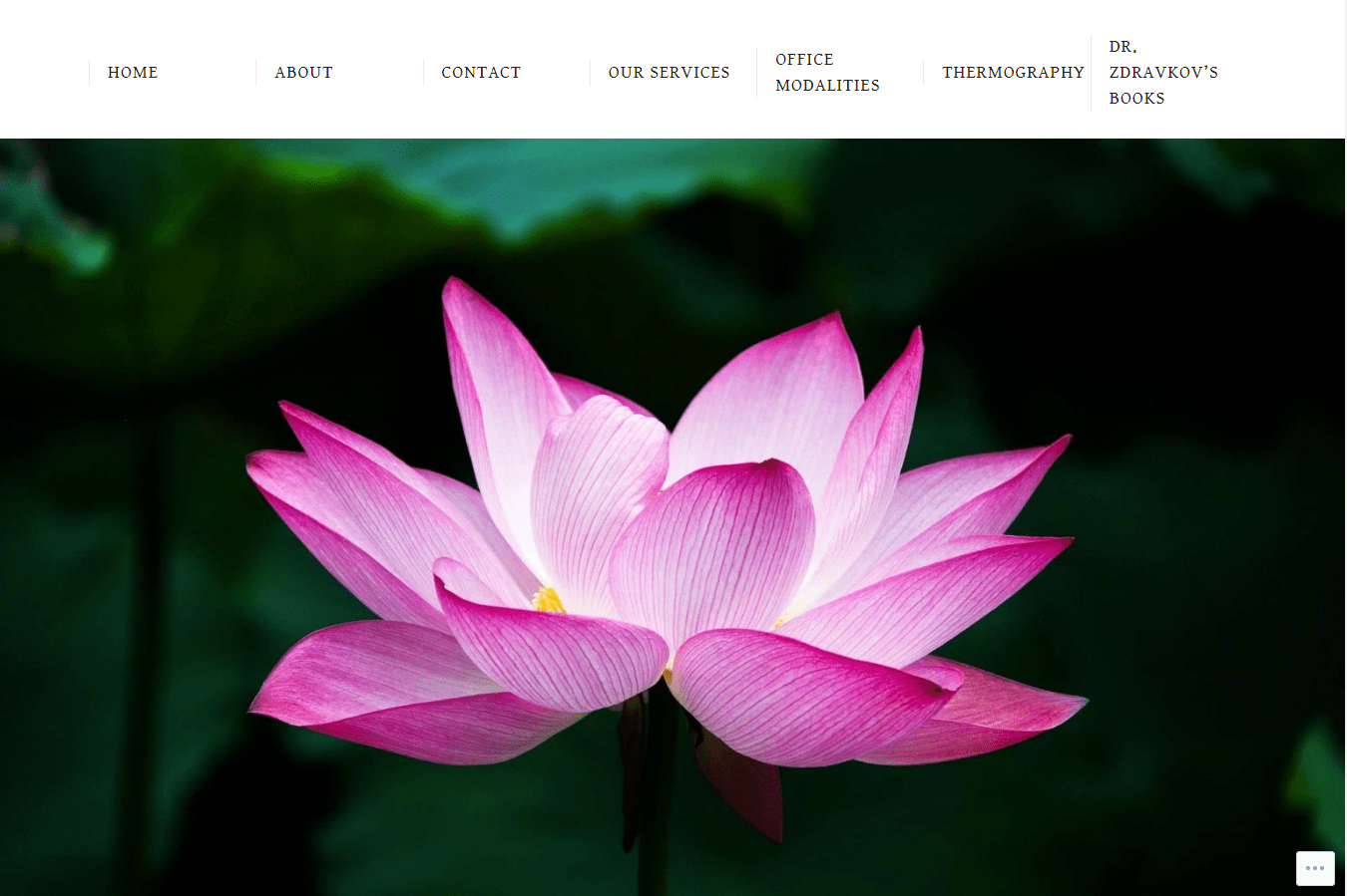
Medical, Health, And Wellness Website Design Tips
Wondering what your medical website should look like?
Medical Website Construction
If you are a doctor, a therapist, a massage therapist, or a health /wellness practitioner, you might be wondering what your website should look like. Equally important, you may be wondering how your website should function.
Let’s go over some basic principles, so that you can get a good idea of what is involved in contemporary web design.
- Your website needs to be responsive. That means that the site is flexible and adjusts to look and read well across all devices and all browsers. Currently, over 50% of all users will search for you on their phone before they will use a computer.
- Your website needs to be fast loading. Speed is of the essence. Scientific tests have shown that humans have shorter attention spans than chimpanzees. If the website doesn’t load in three seconds, they won’t wait.
- Your website should be attractive. Beauty is good. It keeps people on your pages. If your website is outdated, cluttered, difficult to navigate, poorly laid out, or just plain ugly, you need to do something about it. People will judge you on appearances. If your website is outdated, they will think you and your knowledge base are outdated as well.
- Your website needs to be well laid out. All your primary information, such as name, specialty, and phone number need to be located above the first fold. That is, the section that is visible before the user starts to scroll.
- The pages on your website, seen in the top menu, need to be organized in a logical and coherent manner and need to coordinate with one another. Additionally, links and posts need to be up to date and functional.
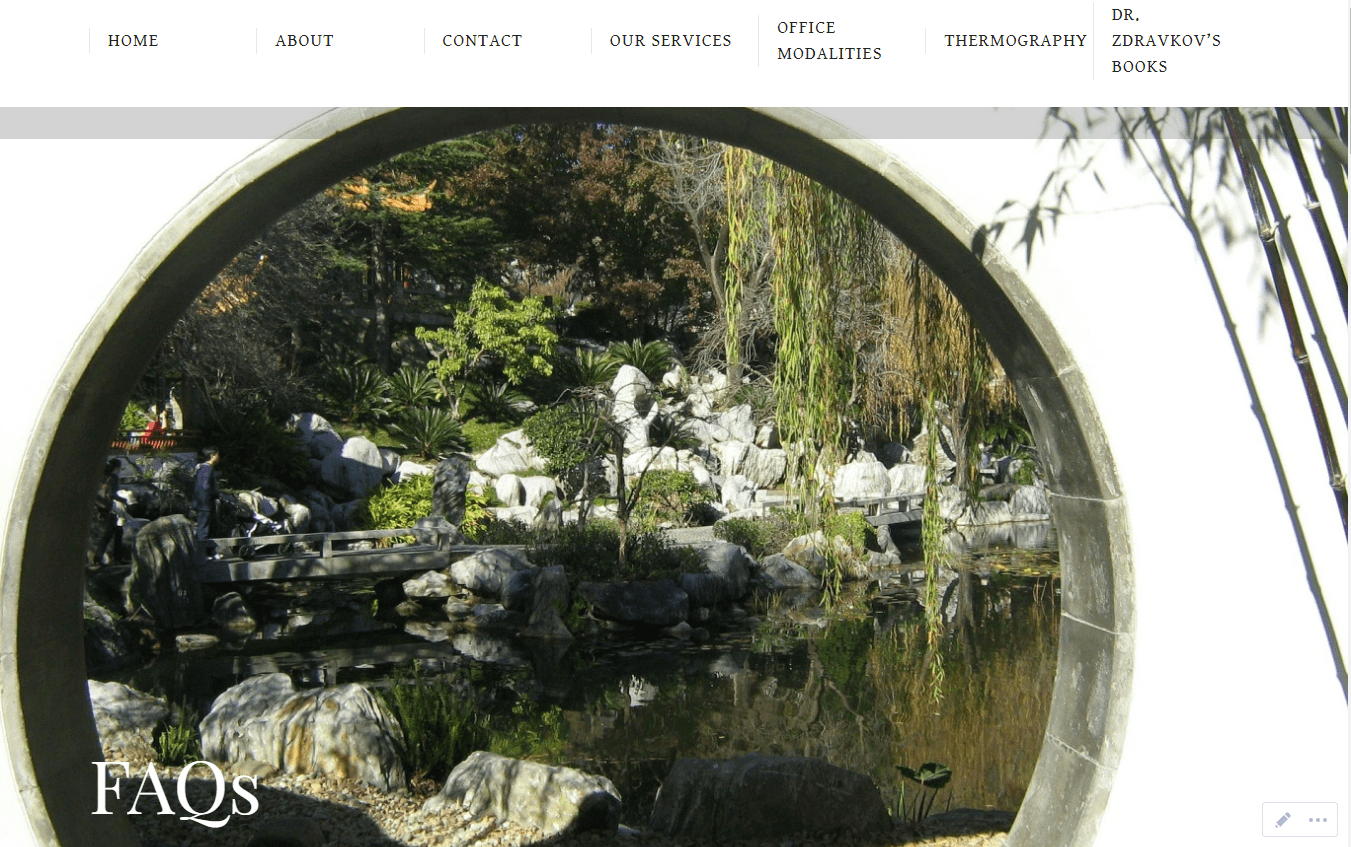
- You need to have a FAQ (frequently asked questions) section. Patients and clients will desire to know about your insurance and payment policies.
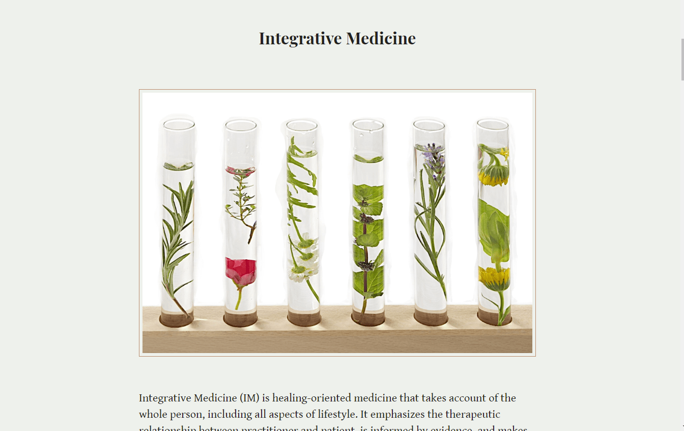
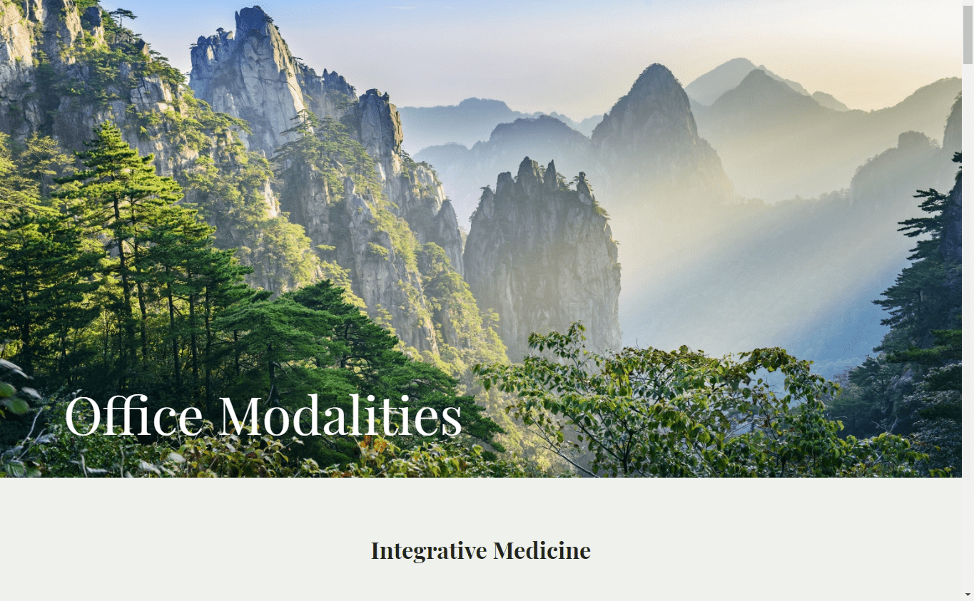
- Modalities / services/ specialties. It is critical that you describe what you do, all the modalities that you practice, in easy to understand, layman’s terms. Remember, even PhD’s like to read at an eight grade level.
- Security / https. Https means that your site is secure. It protects user data. You can obtain it through a SSL certificate.
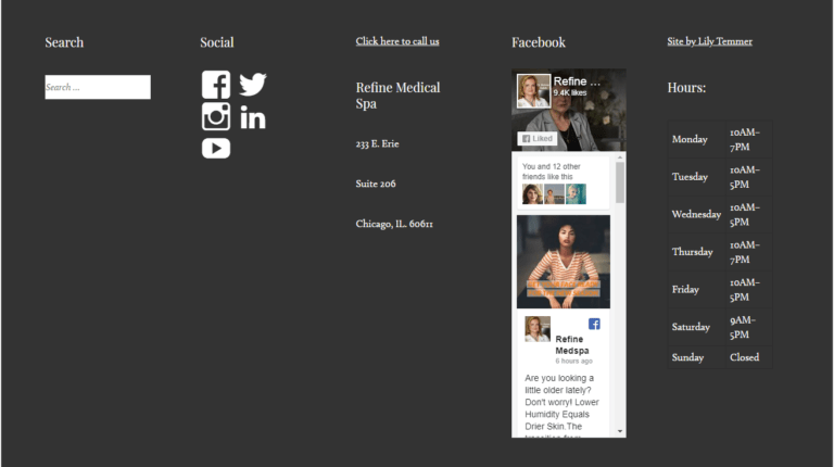
- Footers. I like to make footers universal; that is, visible on every page. I always include name of the practice, address, hours, contact information, copywrite date, social media buttons, and phone number. There is a simple plug in or code that can make the phone number dial directly from the preheader of footer. Sometimes, I will include a site map for ease of navigation, a map to the location or a social media feed. It can look pretty impressive to have your feed featured right from the footer.
One thing that I would advise against is putting patient testimonials on a medical website. It’s against the law in some states to do so and it can look a bit crass depending on your medical specialty. If you practice aesthetic medicine and feature authorized before and afters, you can include testimonials..
We will discuss how softwares can populate patient reviews to various sites in a future post.
Medical Website Aesthetics
Now, let’s talk a bit about the aesthetics of your site. Remember what I said before – over half your clients and patients are conducting searches from a smart phone.
- Simple is good. I have a lot of tricks and animation on my website because I have to show you what I can do, and I admit, I love special effects. Your patients or clients are going to be looking for information, so overwhelming them with trendy visuals isn’t the best policy. Sure, you can have some lovely, catchy motion effects but not in every section.
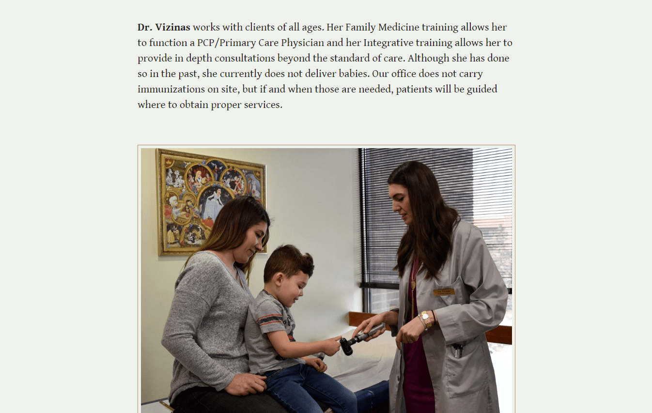
- Keep it real. You, your staff, your office will give visitors a greater sense of who you are than a bunch of stock photos of models dressed up as doctors. However, you can use stock photos of modalities, in headers, and so on to make the site attractive.
- Video. I love it. I use it, and you should too. Welcome the viewer with a video. They’ll be seeing the real you and getting a sense of what you are like. If you are practicing aesthetic medicine, show videos of your injection techniques, various procedures, and patients speaking about their results. If you are a psychologist / therapist, you can upload your YouTube self help videos to your site. If you are a massage therapist, you can feature beautiful videos of your massage techniques. These look particularly impressive in headers and I’ve seen some gorgeous examples used in the websites of upscale spas.
Color
Folks, hospital blue and bright white is so yesterday. Even if you choose blue and white as your palate, there are all sorts of shades and hues of those colors, ranging from cloud to dove grey to grey-blue, blue-green, turquoise, cerulean, azure, and about forty other variations. Also, think green. Green is indicative of health and wellness. Again, nuanced colors are chic, elegant, and dare I say, classy. Colors can stimulate calmness and tranquility, and thus, reassure your patients.
Men, remember when making design decisions, females prefer softer, less bright colors. No one likes brown or maroon and orange is only popular with creatives and millennials.
Colors need to harmonize and create an ambiance. It’s trendy now to place images or blocks of information in horizontal sections. These sections are usually colorized and stacked one a top another with no white space in-between. This can look gorgeous if your web designer is a good colorist and terrible if they senselessly slap fully saturated colors next to each other, I’ve seen green, purple, orange, and brown next to each other. Not only is it garish, it creates a sense of disquiet in the user.
These colors, on the other hand, induce tranquility, calmness, and well being in a viewer.
Written Content
It’s critically important that you describe everything that you do in an easy to understand manner. Appropriately sized headings, sections, attractive fonts, light backgrounds and darker fonts are all important for visibility and on page SEO. No one over thirty – five wants to read light grey print, or white lettering on a black background, or have to deal with tiny fronts. Statistically, eyesight is worsening for all demographics globally, so make your content easy to read. Proof read everything and run it through spell check, too. Google prefers 350-700 words per page and 1000-1800 per post.
Contact and Call to Action Buttons
Make it easy for people to contact you. Remember, phone numbers in the preheader and footer, links to the contact page, and a contact form are mandatory. Popping up more frequently are chat boxes and booking software. What you choose is dependent on your staff structure and levels of comfort with technology. However, people have gotten used to instantaneous gratification and you have to make it fast and convenient for them to contact you in order to stay ahead of your competition.
Let's End the Post with an Example: